Plotting with Python - learning rate
I have been experimenting with a number of deep-neural-network models. In order to understand the effect of altering a model or its parameters, a common requirement is to plot the results of each experiment in a consistent way.
For an openai game of Atari Breakout, a reinforcement-learning agent hopefully gets better at the game the more it plays. An average score over several games played generally gives a better idea of how well the agent is doing than considering the score for each individual game played.
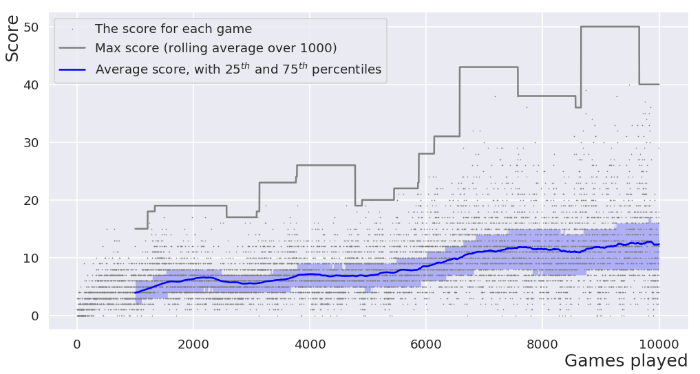
The Python script below plots the scores of an agent recorded in a CSV file, to highlight the learning rate of the agent. It also displays the maximum score along with a rolling average (over 1000 games), along with 25th and 75th percentiles. Ten thousand games is still relatively early for the particular DQN agent being plotted here. The score continues to increase the more it plays … but defeating the game is not the subject of the current page.
Since the script is simple, code is preferred over config for all parameters except the name of the file to be plotted.
The plot displayed here was saved as a png - it's a raster image weighing around 90kB. If you prefer your graphics scalable, simply change the filename so that savefig outputs an .svg - the equivalent image weighing around 1500kB is here.
import argparse
import matplotlib.pyplot as plt
import pandas as pd
import seaborn as sns

def plot_learning(filename, window_size):
    """Creates a formatted figure of the scores achieved by the agent.

    :param filename: a csv containing at least 'episode' and 'score' columns
    :param window_size: the number of games to calculate rolling averages over
    """

    df = pd.read_csv(filename)
    roll = df['score'].rolling(window_size)

    sns.set()
    sns.set_context("poster")
    plt.figure(figsize=(20,10))
    x = df['episode']
    plt.plot(x, df['score'], 'o', markersize=1, color='gray',
            label='The score for each game')
    plt.plot(x, roll.max(), linewidth=1, color='gray',
            label="Max score (rolling window of %d games)" % window_size)
    plt.plot(x, roll.mean(), linewidth=3, color='blue',
            label="Average score, with $25^{th}$ and $75^{th}$ percentiles")
    plt.fill_between(x, roll.quantile(0.25), roll.quantile(0.75),
            alpha=0.25, linewidth=0, color='blue')
    plt.legend(loc='best')
    sns.despine()

    xmin, xmax, ymin, ymax = plt.axis()
    plt.axis((0, xmax, -0.1, ymax))

    plt.xlabel("Games played", horizontalalignment='right', x=1.0, fontsize=30)
    plt.ylabel("Score", horizontalalignment='right', y=1.0, fontsize=30)
    plt.savefig('learning_rate.png', dpi=60, bbox_inches='tight')

if __name__ == "__main__":
    parser = argparse.ArgumentParser()
    parser.add_argument('filename', help='csv filename to plot')
    window_size = 1000 # number of games to average over
    plot_learning(parser.parse_args().filename, window_size)
For clarity, here is a snippet of the csv file from which the above plot was generated. Note that only the episode (i.e. the sequence number for each game of breakout that the agent played) and score columns are referenced in the script to plot the learning rate.
episode,steps,score,epsilon
0,238,1,1.00
1,184,0,1.00
2,208,1,1.00
3,361,3,1.00
4,220,1,1.00
5,174,0,1.00
...
...
...
9994,813,13,0.10
9995,416,5,0.10
9996,978,18,0.10
9997,894,16,0.10
9998,1004,17,0.10
9999,640,7,0.10
A Minimal Version
The above script is relatively specific, but should be clear enough to make it simple to alter for other purposes. A script that parses and plots a csv file, default formatting and all, starts substantially shorter:
import matplotlib.pyplot as plt
import pandas
df = pandas.read_csv('minimal.csv')
df.plot('x', 'y') #Plots based on labels in first line of csv
plt.savefig('minimal.png')
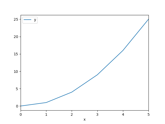
Output from the tiny script using the data below.
x,y
0,0
1,1
2,4
3,9
4,16
5,25
⁂